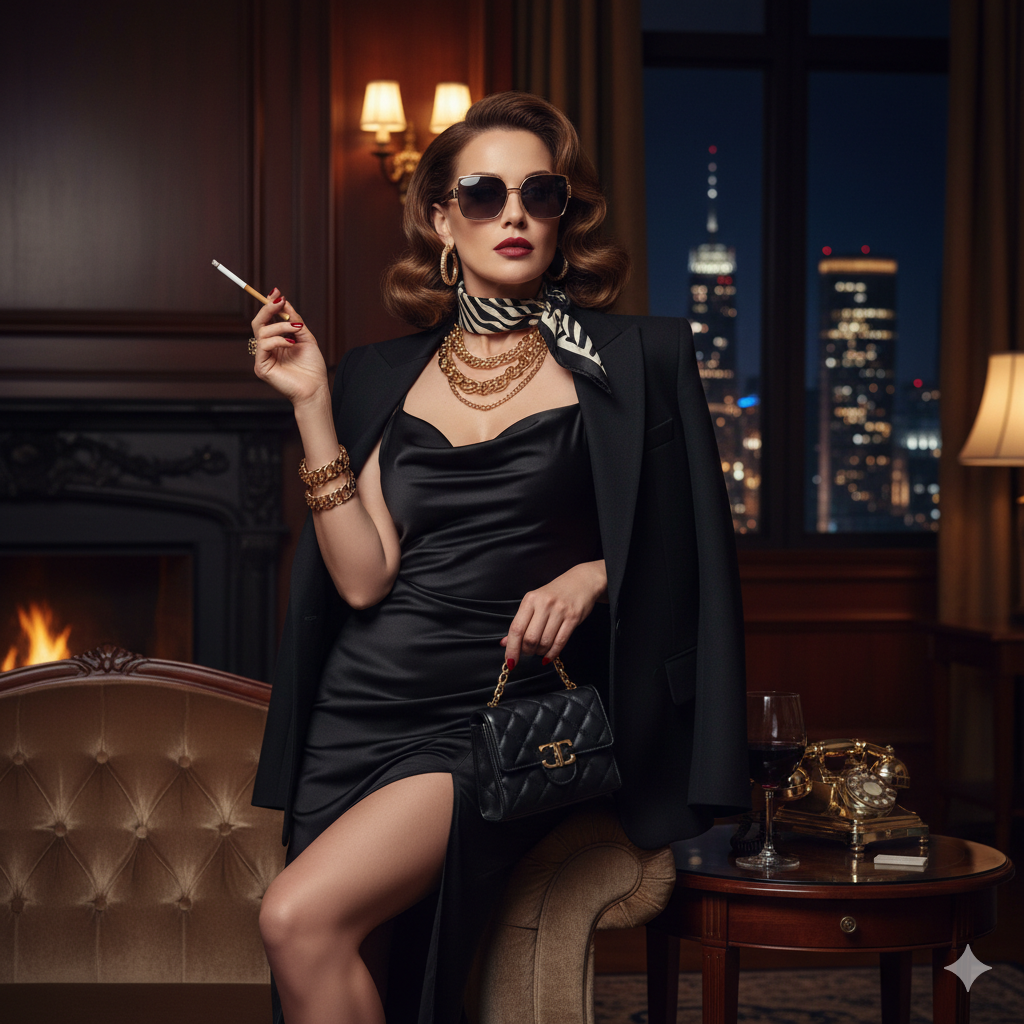
Alright, fashion adventurers, let’s talk about a trend that’s been electrifying the runways and dominating street style for seasons: Color Clashing. Forget the old rules about sticking to a cohesive palette; this is about intentionally pairing hues that, on paper, might seem to fight but in reality, create a dynamic, head-turning harmony. It’s bold, it’s playful, and it’s surprisingly easy to master once you know the tricks.
Historically, color clashing was seen as a fashion faux pas. But as designers push boundaries and personal expression takes center stage, these unexpected pairings have become a hallmark of confident, contemporary style. As fashion stylist and consultant, Tan France, often quips, “Life’s too short to wear boring colors!”
Ready to inject some serious vibrancy into your wardrobe and finally break free from the monochromatic comfort zone? Let’s dive into the fundamentals of fearless color combinations.
The Power of the Color Wheel: Your Secret Weapon
Before you start throwing every bright item you own together, let’s get acquainted with your best friend in color theory: the color wheel. Understanding this simple tool will unlock endless possibilities for exciting clashes.
Key Principles:
- Complementary Colors: These are colors directly opposite each other on the color wheel (e.g., blue and orange, red and green, yellow and purple). They offer the highest contrast and create a vibrant, energetic clash.
- Analogous Colors: These are three colors next to each other on the color wheel (e.g., blue, blue-green, and green). While not a “clash” in the traditional sense, introducing a bold, contrasting accent to an analogous base can create a sophisticated clash.
- Triadic Colors: These are three colors evenly spaced around the color wheel (e.g., red, yellow, and blue). This combination is inherently balanced yet incredibly bold.
Beginner’s Tip:
Start with complementary colors. A blue top with orange trousers, or a purple skirt with a yellow bag – these are classic, impactful clashes that are surprisingly easy to pull off.
Mastering the Art of the “Pop”: Strategic Clashing
You don’t have to go head-to-toe in contrasting brights right away. Sometimes, a strategic “pop” of clashing color is all it takes to elevate an outfit from ordinary to extraordinary.
Styling Tips:
- Accent Pieces: Introduce a clashing color through accessories. Think a bright red belt against a pink dress, a vibrant yellow shoe with a purple outfit, or a shocking pink bag with a forest green ensemble. This is the safest way to experiment without feeling overwhelmed.
- Color Blocking: This technique involves pairing large blocks of two or more solid, clashing colors together. For instance, a royal blue blazer over a fuchsia top with emerald green trousers. The key is clean lines and simple silhouettes to let the colors do all the talking.
- The “Grounding Neutral”: If you’re nervous, use a neutral base (white, black, beige) and then introduce two clashing colors on top. For example, a black dress with a bright orange blazer and shocking pink heels. The neutral provides a visual break and makes the bold colors feel more deliberate.
Fashion Expert Quote:
“The beauty of color clashing is that it allows for individual expression,” says celebrity stylist, Karla Welch. “It’s about having fun and not taking fashion too seriously. Start small, maybe with a vibrant shoe, and build your confidence from there.”
Beyond the Basics: Advanced Clashing & Texture Play
Once you’re comfortable with basic complementary pairings, you can start to experiment with more nuanced clashes and even incorporate different textures to add depth.
Advanced Techniques:
- Unexpected Trios: Combine three colors that might not immediately make sense together, but somehow work. Think emerald green, electric blue, and a pop of neon yellow. Look for hues with similar saturation levels to keep the look cohesive despite the contrast.
- Prints and Patterns: Introduce a clashing color through a patterned piece. A floral dress with a dominant blue could be paired with a vibrant orange jacket. The print helps to bridge the gap between the clashing solids.
- Texture Contrast: Pair a bright, clashing color in a luxurious texture (like a satin skirt) with a more casual clashing color in a different texture (like a chunky knit sweater). The textural difference adds another layer of interest to your bold color choices.
Celebrity & Influencer Examples:
From Rihanna’s iconic Met Gala looks to the everyday street style of influencers like Pernille Teisbaek, who expertly mixes unexpected brights, the red carpet and social media are rife with inspiration for daring color combinations. Think fuchsia and red, orange and pink, or green and purple – these combinations, once considered jarring, are now the height of chic.
Dare to Clash!
Color clashing is more than just a trend; it’s a mindset that encourages creativity and self-expression. It’s about breaking free from conventional rules and embracing the joy that vibrant colors can bring to your wardrobe and your mood. It shows confidence, playfulness, and a keen eye for modern style.
So, go ahead! Raid your closet, pull out those forgotten brights, and start experimenting. You might be surprised by the stunning combinations you can create.
What’s your go-to bold color combo? Or which clashing pair are you excited to try first? Share your vibrant thoughts in the comments below!